
Form Accessibility
Applications, surveys and registrations are common ways to collect information, traditionally using paper forms. Electronic forms offer a fast, convenient and cost-effective alternative, eliminating the need for printing or physical storage. They enable better data management, faster processing and fewer errors, while also reducing environmental impact.
When publishing electronic forms, ensure they are accessible. This guide provides an overview of common forms and techniques to verify accessibility.
Common Forms
Clive
Clive is a Hannon Hill product that provides an easy-to-use interface to create forms for webpages. Integrated directly within Cascade, our Content Management System for Clemson websites, Clive forms are accessible out of the box. For details, contact your web manager, visit the Clive Help Center or submit a Web Technical Update Request to Marketing and Communications.
Google Forms
Google Forms allow users to create accessible surveys. Google Forms are free to use with your Google Workspace for Education (g.clemson.edu) account. Get started with Google Forms.
Microsoft Forms
Microsoft Forms allow users to create accessible surveys, quizzes and polls. Microsoft Forms are available to all Clemson users. Create a form with Microsoft Forms.
PDF Forms
PDF forms can be accessible, but require a non-trivial amount of effort. Visit our PDF guide for an overview of PDF accessibility, including comprehensive guidance on PDF forms. Alternatively, on-demand remediation services are available at a low cost.
Qualtrics
Qualtrics is a robust survey tool; however, not all features are accessible. Qualtrics provides guidance on survey accessibility, including accessible themes and question types. Follow survey accessibility best practices when creating surveys.
Wrike
Wrike is an enterprise project management tool that can publish accessible forms. To see if Wrike is a good fit, visit the Wrike website or initiate a consultation by submitting a CheckIT request.
Verifying Web Form Accessibility
Forms have several considerations to ensure they do not create barriers for people with disabilities.
Keyboard access and focus
Form controls need to work with a keyboard alone. To test, press the Tab key to navigate through the form. Keyboard focus must be visible and move in a logical order, from one field to the next. Complex form controls, like date pickers, must be fully accessible without using the mouse.
Common keyboard interactions include:
- Tab or Shift+Tab to move forwards and backwards, respectively
- Enter or Spacebar to activate buttons
- Spacebar to open dropdowns or select checkboxes
- Arrow keys to navigate between dropdown items or radio buttons
Multi-page forms
Keyboard focus must also be logical across forms that span multiple pages. Using the keyboard, continue to the second page of the form, typically by pressing Enter on a Submit or Next button. When the second page loads, press the Tab key to continue through the form. The focus should start at the top of the form. Verify this behavior is consistent when moving forward or backward between form pages.
Labels
Each input on a form must have a meaningful label. Form labels must also be programmatically associated with their inputs to ensure compatibility with screen readers and assistive technologies.
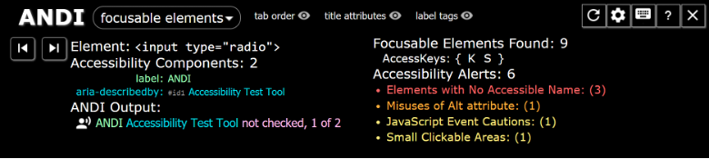
The ANDI browser extension provides a convenient way to verify form labels are properly associated with their inputs. After installing the extension, activate it by selecting the bookmark in your browser’s toolbar. With the focusable elements menu item selected, hover over each element in the form. The ANDI Output indicates the programmatic label for each field. Verify the label reflects the input's purpose.
Increased zoom
Increase the browser zoom to 200% and up to 400%. The form content should “reflow” to fit the screen, preventing the need to scroll both vertically and horizontally. Labels should remain near their controls at increased zoom levels.
Required fields
Ensure required fields are clearly indicated, both visually and programmatically. An asterisk (*) next to a form label is commonly used to indicate required fields.
Color
Ensure sufficient contrast is provided for text, labels, and controls. Color alone must not be used to convey information. For example, if a form error occurs, changing an input’s border to red may not be evident to people with color deficiencies; error text should be included.
CAPTCHA
Some forms include a CAPTCHA to verify the person submitting the form is human. Ensure CAPTCHAs do not rely solely on vision. An audio alternative must be available.
Support
For support, including accessibility testing and remediation guidance, contact the digital accessibility team. For a review of third-party solutions, submit a CheckIT request.